Keys to Dashboard Data Visualization
These are some the questions and processes that I have implemented and built with others over the years to ensure that datasets can be properly ingested in a tool whether it’s Datorama, Tableau, Looker, D3.js custom tool, or some other ETL tool, or god forbid pure excel/Google sheets. A few questions and thoughts as how to approach. Mind you that there are tagging considerations that may be beyond the actual data visualization part but are important given the the inevitable question of “why is my data not showing up even though we’re live right now”;
Which tool will you be using to visualize the datasets?
- Some tools such as tableau give you more flexibility and vast ways to visualize in an environment that is better than excel. Lots of folks know how to use tableau and is leveraged across industries. The downside is building out all the reports necessary to be stored somewhere that can be visualized via tableau later.
- Datorama provides this intermediary solution that has more of a media focused set up. It has its own classification system that are tied to all the media metrics and dimensions which allows the users to connect the the vast amount of APIs they leverage. Individuals are slightly more technical and having a more technical background is nice but is not particularly required.
- Leveraging Looker or a Qlik which will overlay on top of a database without the storage. This route requires more of a technical team who has a strong understand of how to navigate a database. SQL and Javascript become more important here.
- D3.js will require more developer types who understand how to build analytics visualizations leveraging javascript libraries. There is a lot of customizability going this route.
Who owns the data?
- Does the client own the data? Does the company own the data?
- Is there a database that is being leveraged to store the data? does it live on Salesforce Datorama’s end? AWS/S3? Microsoft Sharepoint? Google Sheets?!
- Can the data be accessed via Redshift or Snowflake?
Mandating a naming convention across platform that teams roll out across the various pieces of media they run.
- This piece is incredibly important that will make the visualization significantly easier when the team is cleaning and transforming the data in platform.
- Leverage an excel workbook or online form fill depending how sophisticated that has a prebuilt dropdown system for the naming convention that can allow teams to input and come out with an output that is easy to send to adops or execute themselves. Work with teams to build this component out. The questions that should be asking are the components that clients ask for. “If I name it like so, can I then take this data later to tell a story?!”
- Underscores, dashes, periods, are key!
- Acronyms for often used terms should be used. e.g Retargeting (RT), Audience Targeting (AUD), Lookalikes (LAL)
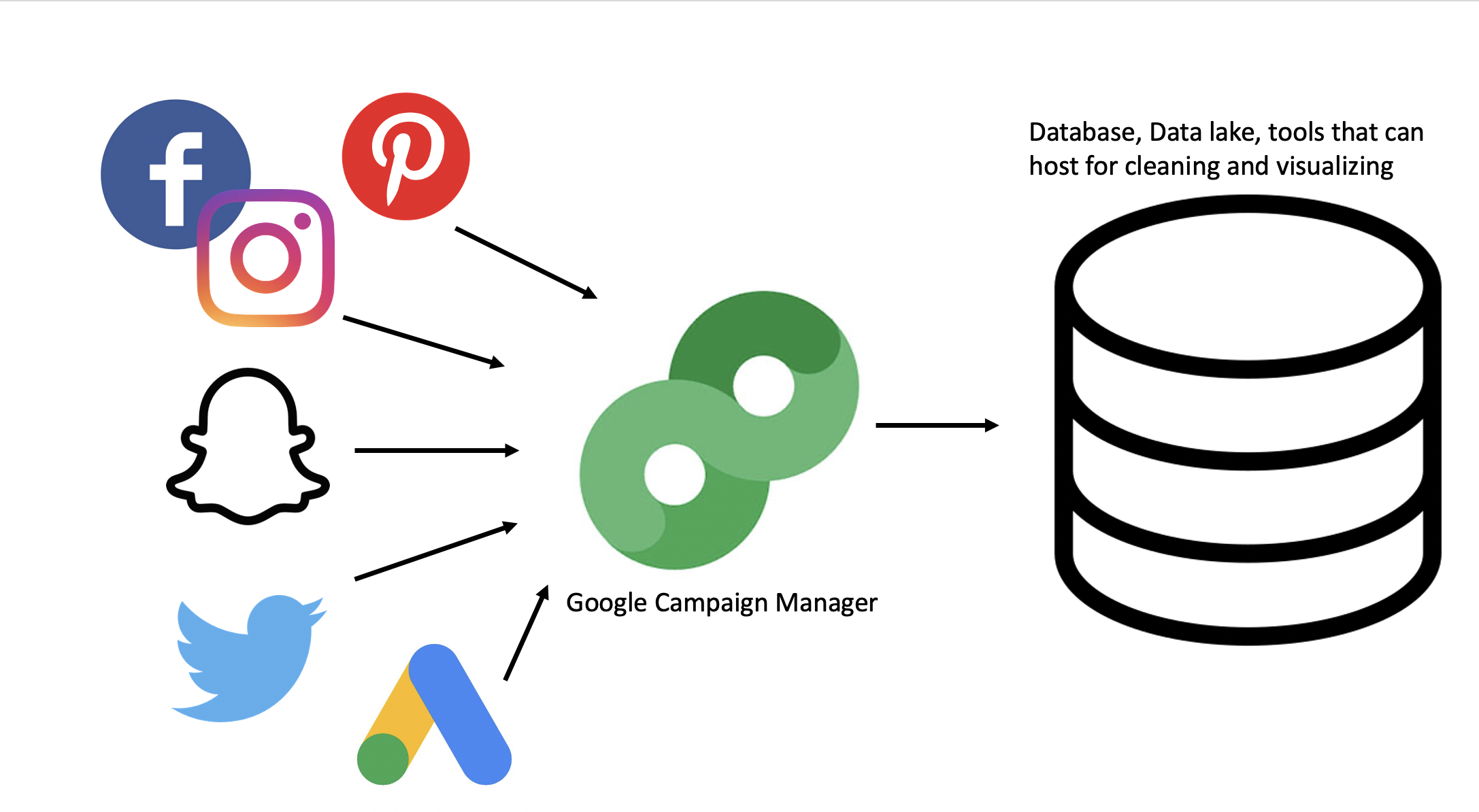
Understanding where your data sources come from and how things are tagged.
- Are you running ads via an ad server? If yes, Are you applying all the tags across all the platforms? Will you be making special exclusions for Facebook/Instagram since third party tags have been convoluted in terms of how they track against? Are your tags wrapped with some special parameters that can mess with the actual tag
- Will you be applying web analytics to the other components of your media. e.g are there custom UTMs being leveraged that are of value. How much of those efforts are overlapping with the ad server if that does exist?
- Are there APIs that can be leveraged to pull in data? Are there any limitations to the APIs in terms of what they can pull? Given that all the biddable platforms evolve quite frequently, on more than one occasion, APIs don’t get updated as quickly so data could potentially be missing. Sometimes APIs aggregate certain components incorrectly. e.g a metric is averaging and average so values are incorrect versus platform
- Which metrics are summable (impr, clicks, spend) vs. non-summable (rates, reach/frequency, Estimated Ad Recall Lift ‘EARL’)
Cleaning & transforming the data to visualize
-
Backend:
- Make sure that all datasources can be tied together by some underlying ID that is unique. It can be a combination of components or simply the IDs that are outputted via the platforms. If the teams are working with an ad server, this simplifies matters a ton.
- Leverage the naming convention to extract various positions to create dimensions
- Build out any necessary custom metrics or rates that are calculated more uniquely with certain partners or platforms
-
Frontend:
- Are there any specific brand colors that need to be used?
- What kind of charts and information would the stakeholders like to see?
- Find ways to reduce the amount of metrics shown so stakeholders aren’t overwhelmed and a better story can be told to help meet OKRs
Quality Control + Feedback
- What do stakeholders think of the first iteration? Was there confusion in the room? Was there a lot of back and forth? Did they intuitive understand how to leverage what was built?
- What does the data look like? Does it match with what has been run? Are the naming conventions on point or adjustments need to be made with some platforms
Finally, the Story
- Does it do a successful tell a story even before digging into the dataset. Are the visualizations being used the best perspective that can be shared to illustrate the performance of media? Does it encourage the stakeholders to leverage the dashboard to get what they need to for their stakeholders?
- This component likely requires the creator or team who can best craft the story to share with the proper stakeholders